This Site
My own portfolio, built with Astro. A place to show photography and projects, and an excuse to sweat details like a canvas ripple animation and build-time EXIF metadata.
This is the site you're on. It's an Astro build for photography, a couple of side projects, and a resume. It's mostly static, so pages ship as fast HTML with only the interactive pieces (the puddle background, the photo lightbox) shipping their own JS.
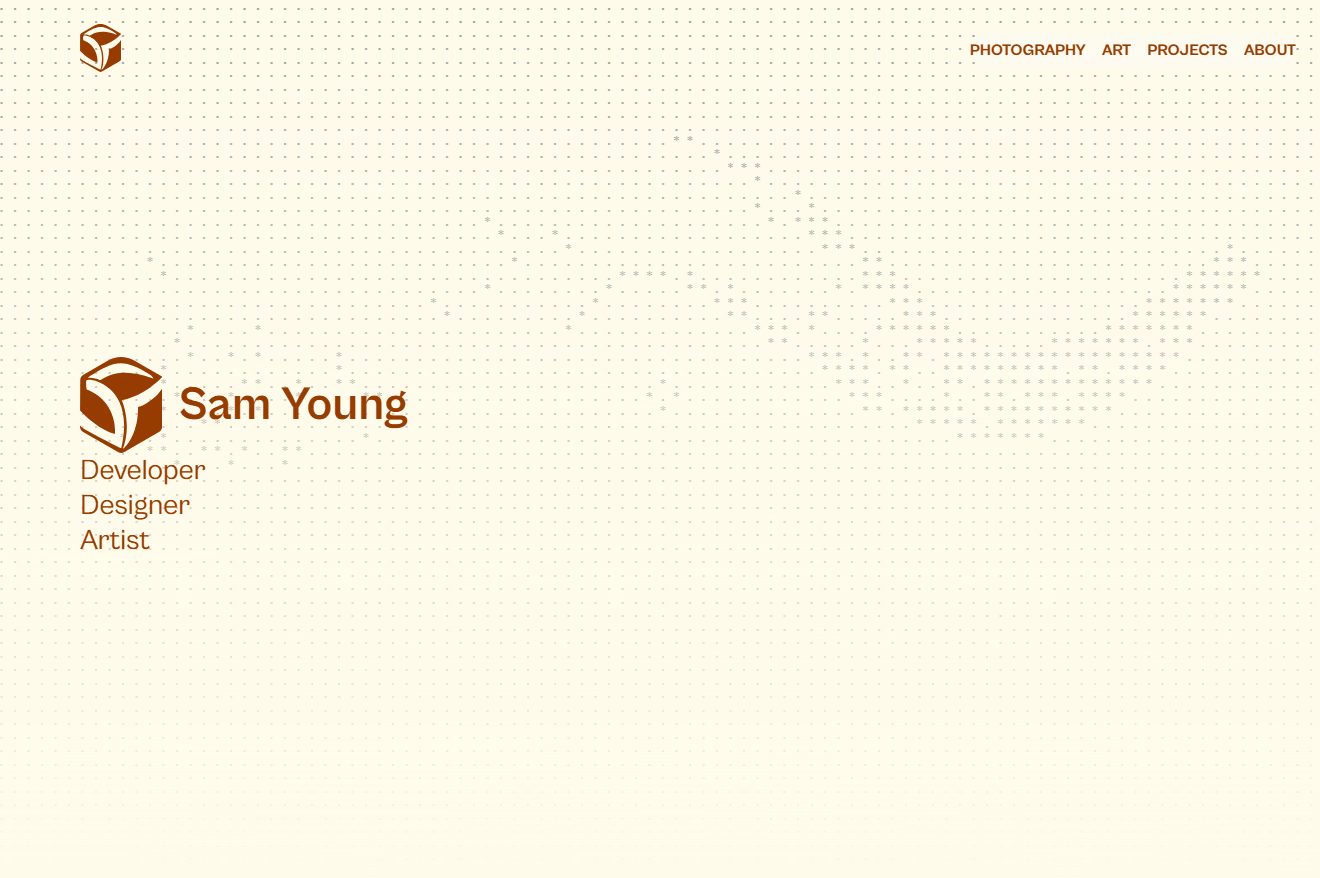
The rippling dot grid on the homepage started from Puddle.js, which renders each grid cell as its own DOM element. A typical viewport needs 1,000 to 4,500 or more cells, more elements and style recalculations than a browser can update at 60fps, so I rewrote it to render the whole grid to a single <canvas>, tracking force values in flat Float32Arrays and only redrawing cells whose neighbors changed on each tick. I leaned on Emil Kowalski's writing on UI feel and his skills to tune it afterward: ripple strength that scales with screen size, snapping small forces to zero so ripples settle cleanly instead of trailing off forever, and respecting prefers-reduced-motion.
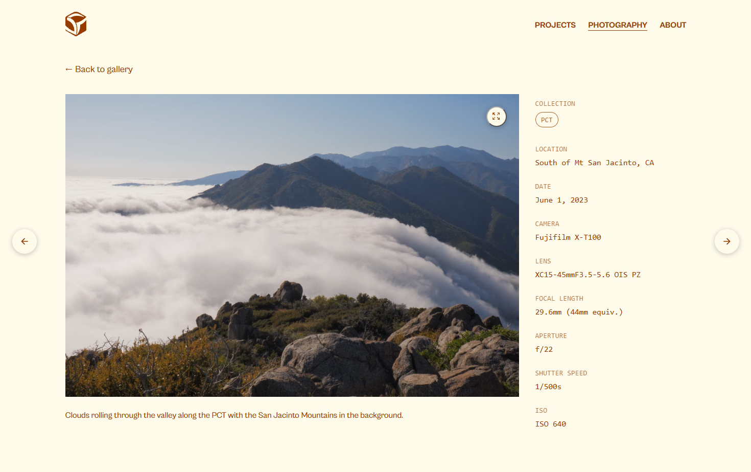
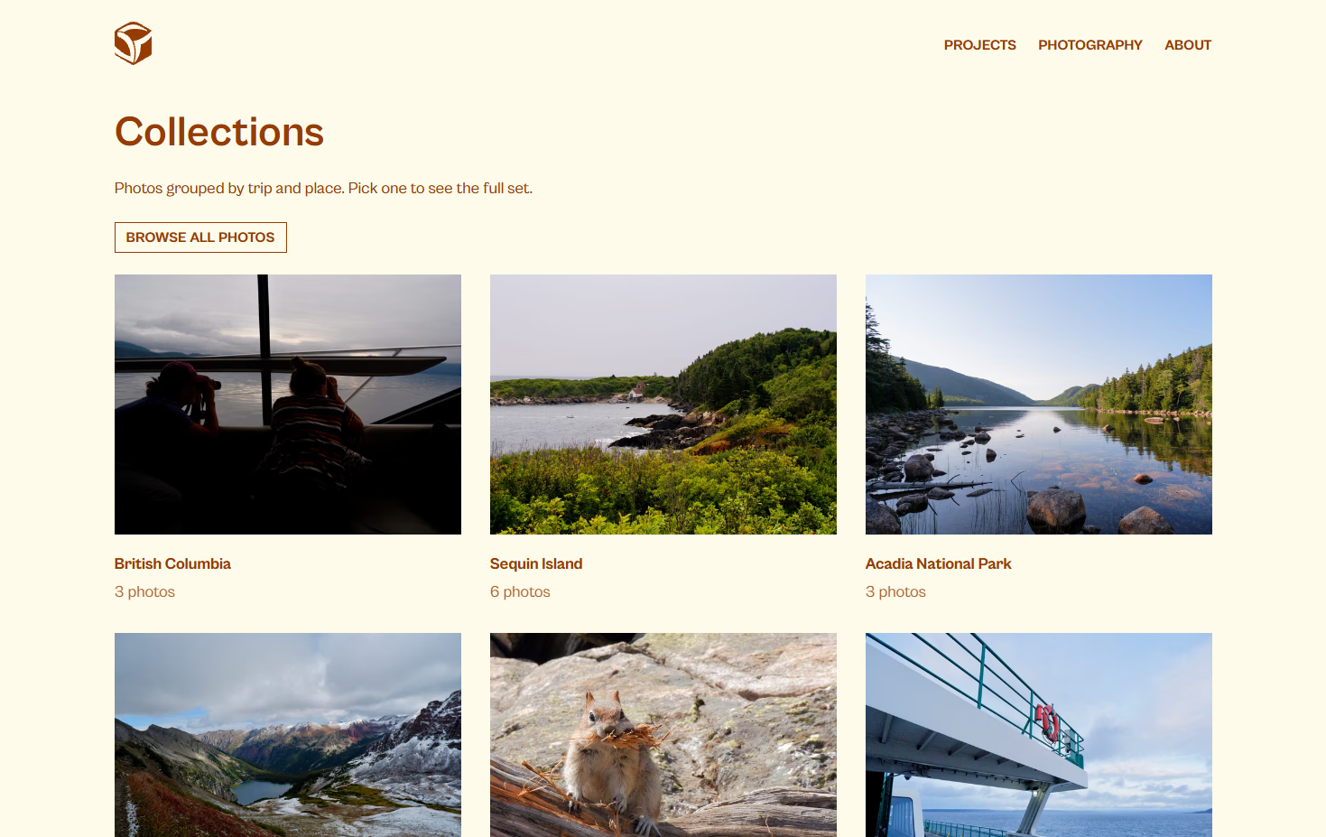
The photography section reads real EXIF data out of each JPEG at build time with exifr: camera, lens, focal length, aperture, shutter speed, ISO, and GPS coordinates. It formats that data for display next to the photo. The data comes straight from the file, so adding a new photo means dropping in a JPEG, not hand-typing camera settings. Along with this locations, descriptions, and tags were added to each photo to provide more detail and to allow for showing images by collection.
The rest is the usual accumulation of small decisions: chasing down Lighthouse warnings across every page, re-encoding a folder of multi-megabyte camera JPEGs down to something that loads quickly without looking compressed, and a handful of passes on the header, footer, and layout to get the site feeling less like a template and more like a specific, considered place.
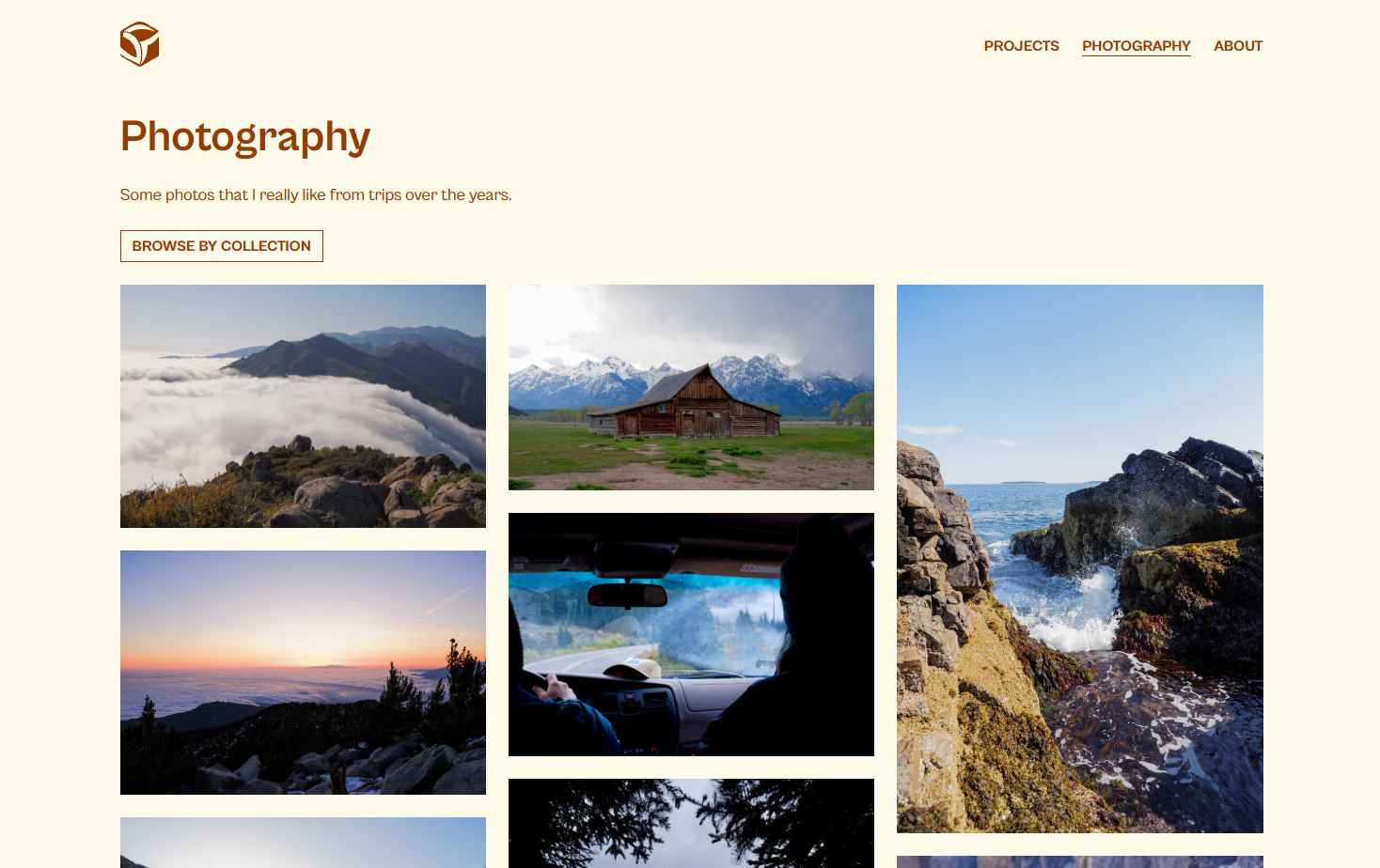
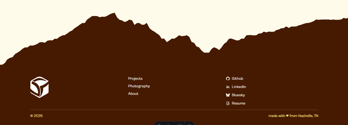
The footer also is a place with a nice touch. One of my photos with a mountain in it had the background removed and was converted into an svg shape to be used for the footer. The result is subtle, calculated, and fits into the site as a whole really well.
I learned a lot about animations, writing code for good performance, and I had a blast making this site go from sketches and ideas to a reality. There are some improvements that can be made for sure, but it is in a great spot as I see it right now.